Architecture of Fear: The Making of Silent Hill 3
1999 in retrospect, was one of the most monumental years in the landscape of culture. Under the foreboding shadow of the Y2K bug and the dawn of a new millennium, the cultural zeitgeist was at a fever pitch— a swirling vortex of energy defined by equal doses of anxiety and excitement fuelled by the digital revolution. In cinema, The Matrix was redefining the mainstream’s relationship with post-modern philosophical ideas regarding reality and symbols. In video games, Hideo Kojima’s Metal Gear Solid was equally redefining the capacity for storytelling within the action genre, boldly forecasting the artificial intelligence boom and subsequent information Age.
With the release of Konami’s Silent Hill in the same year, horror fans saw a paradigm-shifting change in gamer’s perception of what was possible within the horror genre. Gone were the conventional hero narratives with its cut and past tropes and in their place was a more nuanced and ambiguous form of storytelling that drew influence from avant-garde and industrial soundscapes. Silent Hill’s development team dubbed, Team Silent chose to forgo traditional horror tropes seen in Hollywood and mainstream gaming up to that point to produce a title that was fully invested in the atmospherics, and ambiguity that saw it share similarities with David Lynch and the films of Dario Argento. The horrors and monsters that inhabited the world of Silent Hill, took the shape of heavily mutated figures reminiscent of the paintings of Francis Bacon. Quite simply Silent Hill was unlike anything that came before it.
EVOLUTION OF HORROR
With success saw the birth of a sequel in the form of Silent Hill 2-a more personal and introspective story, that delved into the subconscious of the protagonist. Themes of guilt ran through the game and interestingly it offered multiple endings. The film was hailed as a masterpiece, building upon the already strong foundation of its predecessor to deliver a compelling story that was mature, thought-provoking and shocking for audiences.
With the success of the second in the series, the developers at Konami, were met with the incredible task of building upon their success. Did they deliver more of the same? Stick to a tried and tested formula, or aim to innovate and push the limits at the risk of alienating fans who had become attached to the series. Interestingly, the decision that was made for Silent Hill 3 was somewhat of a mid-ground, returning to the roots of the original and resurrecting story threads that had not yet run their course, while simultaneously developing the lessons learned from their previous experiences. Like many projects, some interesting ideas and concepts never make it out of the planning stage into the final product, but this doesn’t mean they are devoid of merit.
Potential monsters, planned stage design concepts and texture plans that were left on the cutting room floor due to budget issues, and deadlines, finally saw an opportunity to make it into reality with the production of Silent Hill 3.
A NEW CONCEPT OF FEAR
An initial concern for developers during the early stages of production, was how best to differentiate the sense of fear from the previous two titles. With increased expectations also saw the need for evolution, and for the screenwriters, a simple rehashing of techniques from the previous entry in the series was never on the cards. While Silent Hill 2 looked to create a sense of fear, through a subtle use of sustained silence that built up over time, Silent Hill 3 saw a more direct and violent conception of horror. Sinister symbols littered the rooms and landscapes of the player's environments, such as floors that seemingly pulsed with blood, and walls that shimmered with a burning texture. The feeling of fear engulfed the player, a far cry from the more internal and introspective horror of Silent Hill 2.
Fashion Meets Character Design
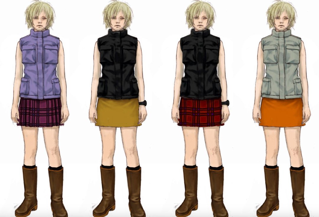
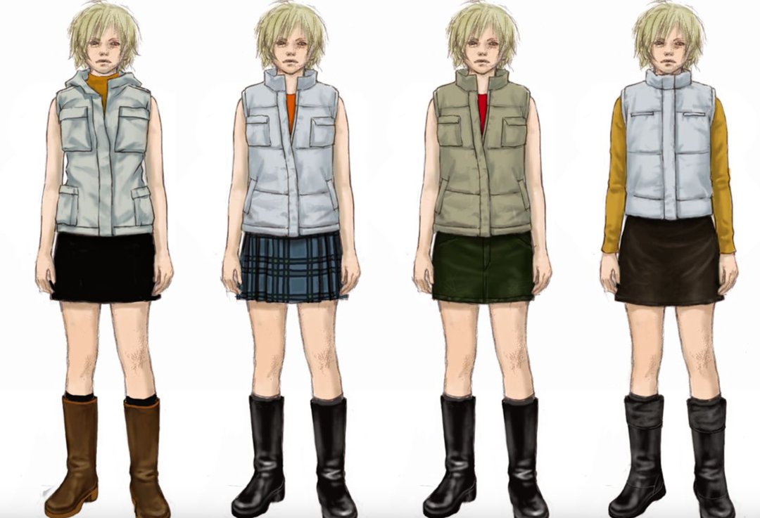
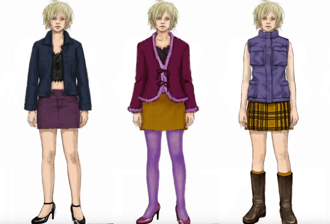
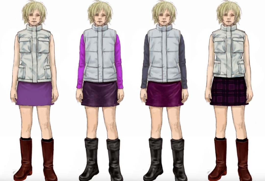
Silent Hill 3, saw another bold choice come in its choice of protagonist. For the first time in the game’s history, we saw the introduction of a female lead, with the creation of Heather Mason, the innocent, yet forceful and relatable heroine of Silent Hill 3. Lead character designer Shingo Yuri—while fleshing out the details of Heather’s appearance—took inspiration from French actors such as Charlotte Gainsbourg and Sophie Marceau which resulted in an initial design that was perceived to be a little too friendly and nice. After taking the counsel of the female members of the team, they settled on a look that was edgier and more fashion-forward. With her disheveled hair, knee high boots, Heather was a reflection of the Y2K fashion scene at the time, bringing a more fashion-conscious sensibility to an industry that is not always known for its style.
Lead protagonist Claudia saw a similar fashion-inspired design take form. While browsing fashion magazines the designers of Silent Hill came across a model with shaved eyebrows and a slightly androgynous look. It was this lack of eyebrows that resonated with the team when they realised it prevented the players from easily reading the emotions of the game’s main villain. There was a cold, statuesque and unfeeling atmosphere to Claudia’s design, perfectly mirroring the personality of the morally ambiguous cult leader. In the eyes of Claudia, she was the protagonist of the story and the team behind Silent Hill wanted a look that best reflected this ambiguity.
Concept art for Claudia Wolf
ART HISTORY INSPIRES
Each monster in Silent Hill is a disturbing construction perfectly designed to arouse fear in the player. The secret to their unsettling atmosphere lies in art director, Masahiro Ito’s minimalist deformation of the human body. Rather than use traditional symbols associated with fear such as forked tails, horns or razor claws, Ito subtly alters the human form in grotesque ways, threatening the player with appendages and features that are not so far removed from their own.
For inspiration, Ito drew from the history of art, reformulating representations of hell into a more modern context. In particular, his creature designs can see many parallels with the work of Hieronymus Bosch—a Dutch painter from the Middle Ages, known for his fantastical illustrations of religious concepts and narratives. His work The Garden of Earthly Delights greatly inspired the monsters of Silent Hill 3, shaping the surreal, deformed body structures.
Hieronymus Bosch, The Garden of Earthly Delights (detail), 1490-1500, oil on oak panel.
““What You Call Faith Is Nothing More Than A Child Crying Out For Love.””
AMBIGUITY AND MORALITY
While Silent Hill 3 stylistically evolved itself, building upon the strong visual themes of the previous two, one thing that they didn’t so much radically change—more so tweak—was a morally ambiguous story and a narrative world that constantly cast doubt upon the viewer. There is a key scene in which one of the characters Vincent—a corrupt and sinister priest—shockingly admonishes Heather for calling the enemies that you have encountered up to that point as “monsters”. It is this comment that interestingly brings up a post-modern idea that was prevalent in Japanese games during that period. That one’s reality may not be the same as another, that morals and perception are little more than reflected phenomena of our inner values. This viewpoint is echoed in the words of characters such “The Boss” from Metal Gear Solid 3, when she expresses her opinions on “tomorrow’s enemies” being “today’s friends” or Final Fantasy 7’s thematic wrestling with concepts of identity and the self.
It is this depth of thematic substance that made Silent Hill 3 stand out from rival titles such as Capcom’s Resident Evil. With Silent Hill 3, just like its predecessors, its creative team wanted to make something that went beyond a mere horror game and created something thoughtful and transgressive. A game that remains inside us, all these years later.


